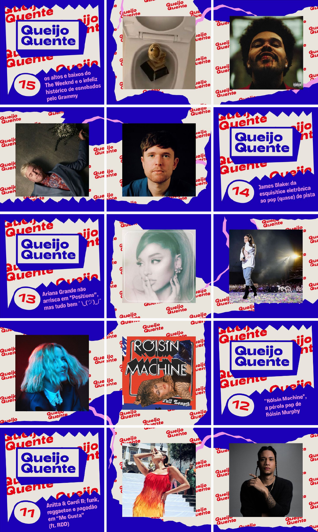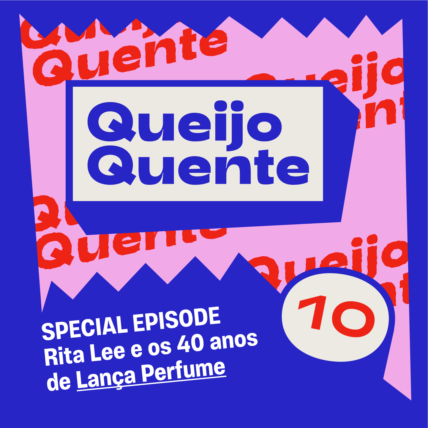
Queijo Quente Podcast
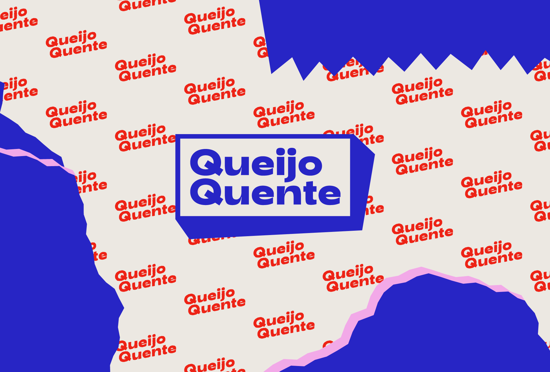
visual identity + logotype
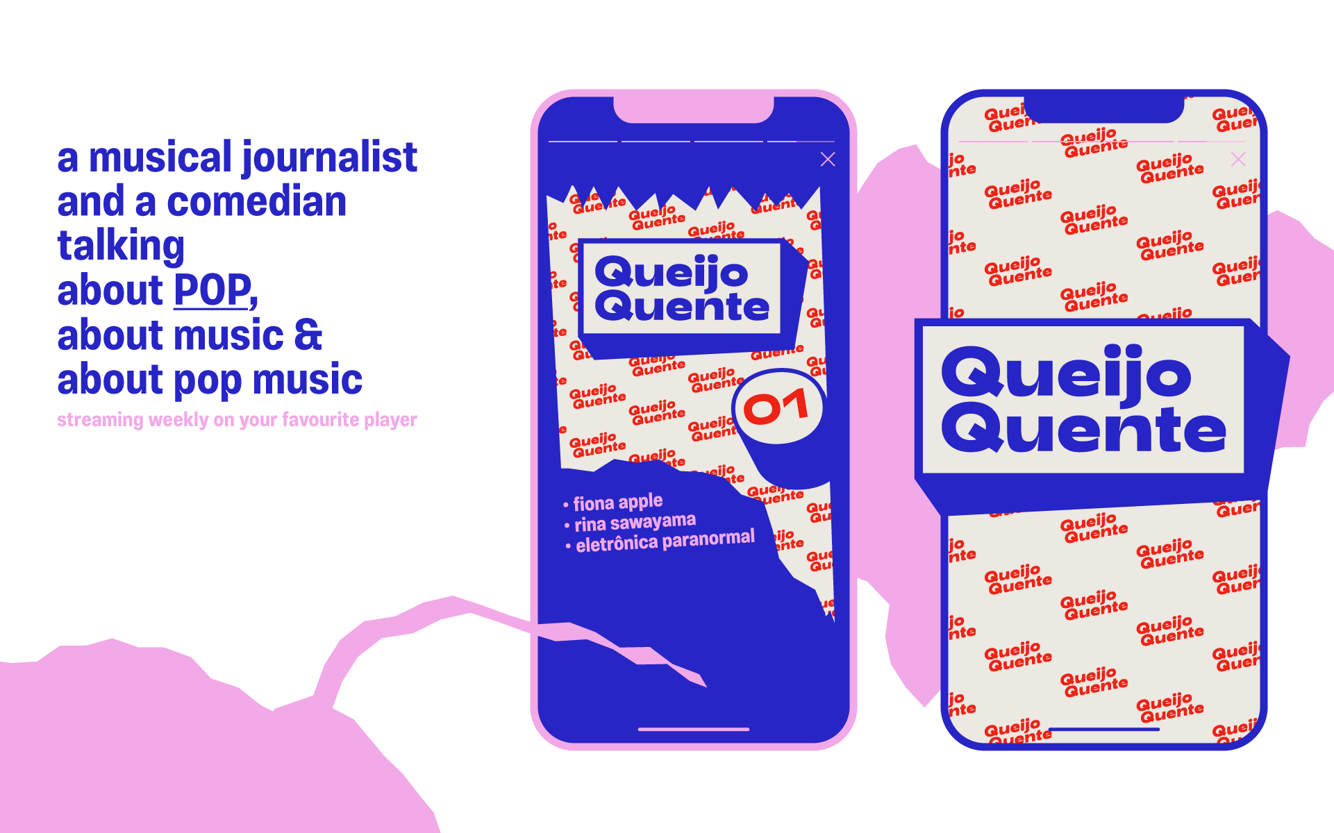
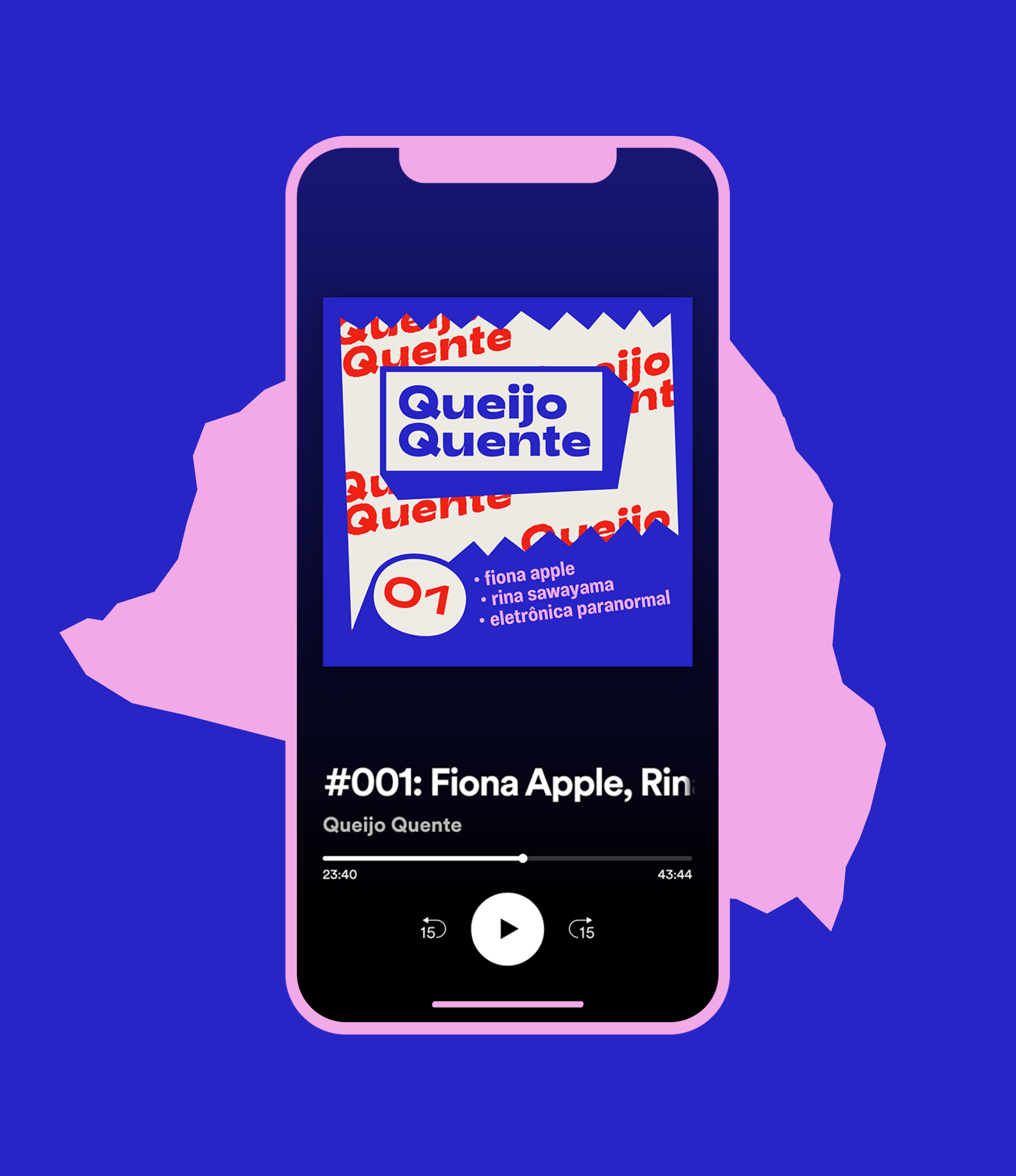
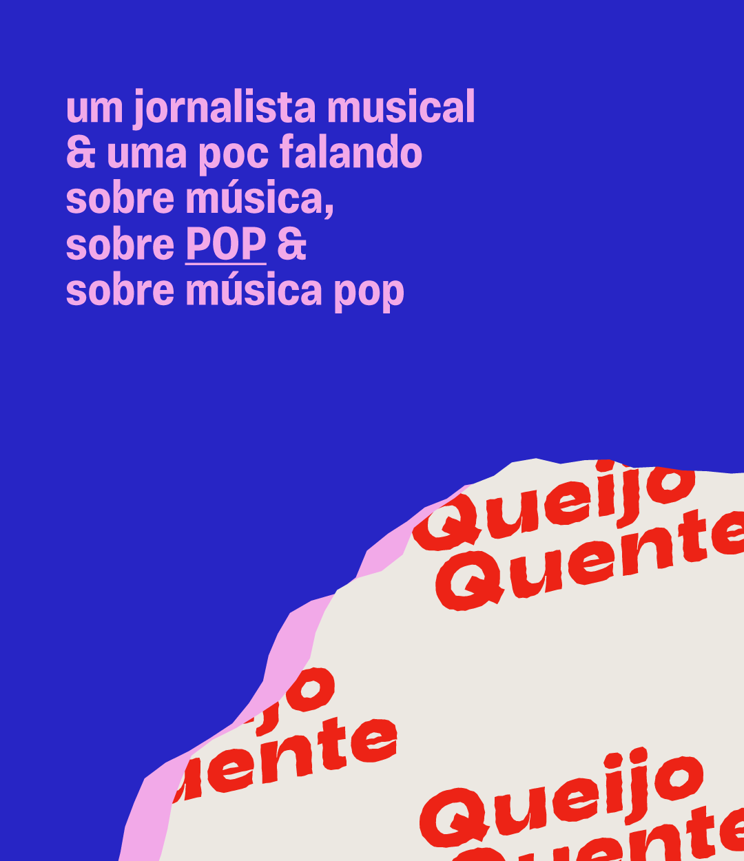
Queijo Quente is a podcast about pop music that delivers weekly doses of high-quality information about various topics of the pop universe with a humorous, laidback vibe. I was asked to design a logotype and a brand identity system for the covers appearing on the podcast players and their social media presence.
︎ March 2020
design Daniel Rocha
presented by Guilherme Guedes, Lohan Abdala and Dora Guerra
fonts in use Adieu Bold + Vinila
"Queijo Quente" is Portuguese for "grilled cheese sandwich", which is the quintessential practical snack, easy and always tasty, anywhere, anytime. The design further explores this concept and takes inspiration from Brazilian street food packaging. Popcorn and other treats sold in small street carts usually come in a cheaply printed paper bag with the product name repeated all over it. Having the logo repeated as a pattern is also a reference to sticky pop songs that stick to your head like caramel popcorn sticks to your fingers.
The color palette is a not-so-subtle play on how the combination of red and blue quickly screams "USA" and therefore, pop music culture in general. The whole Americana vibe is toned down with pale beige backgrounds and neon pink details.