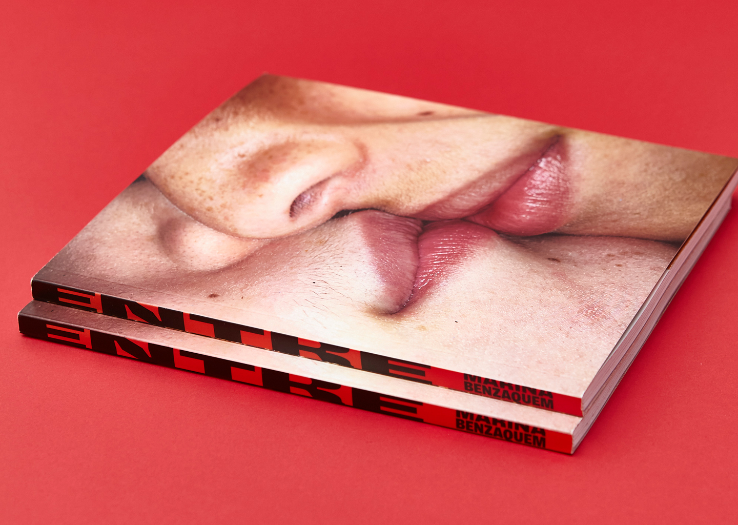
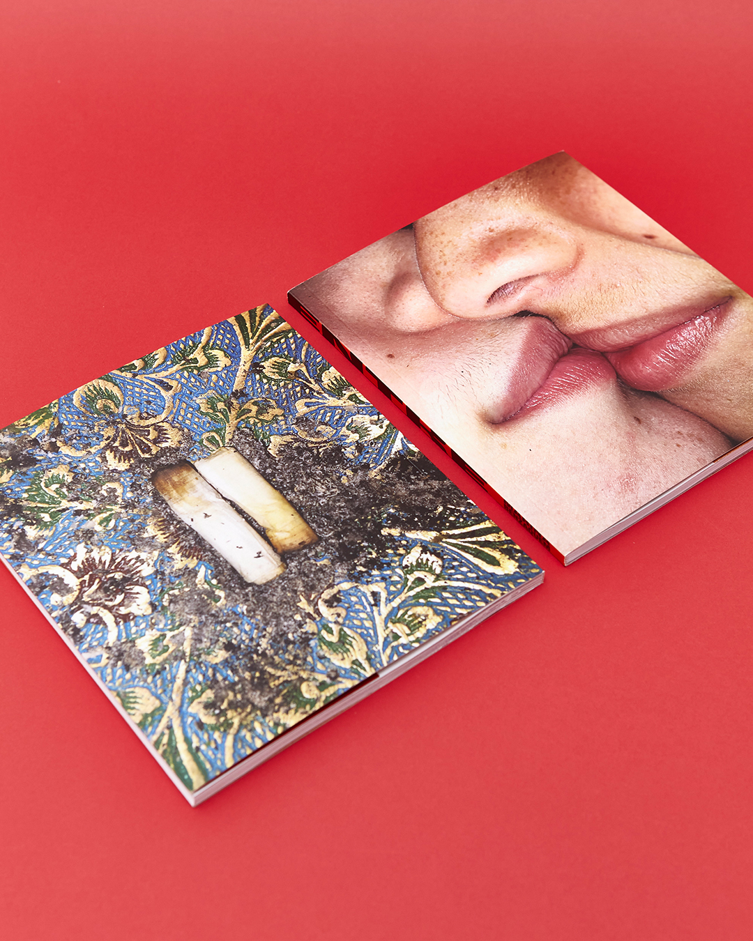
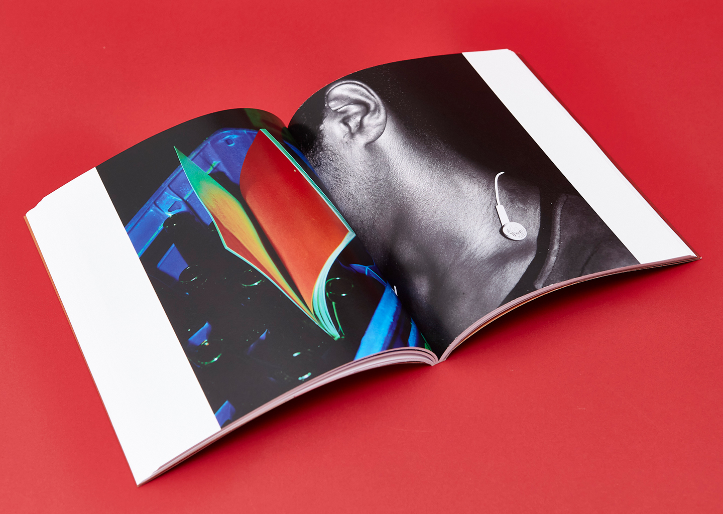
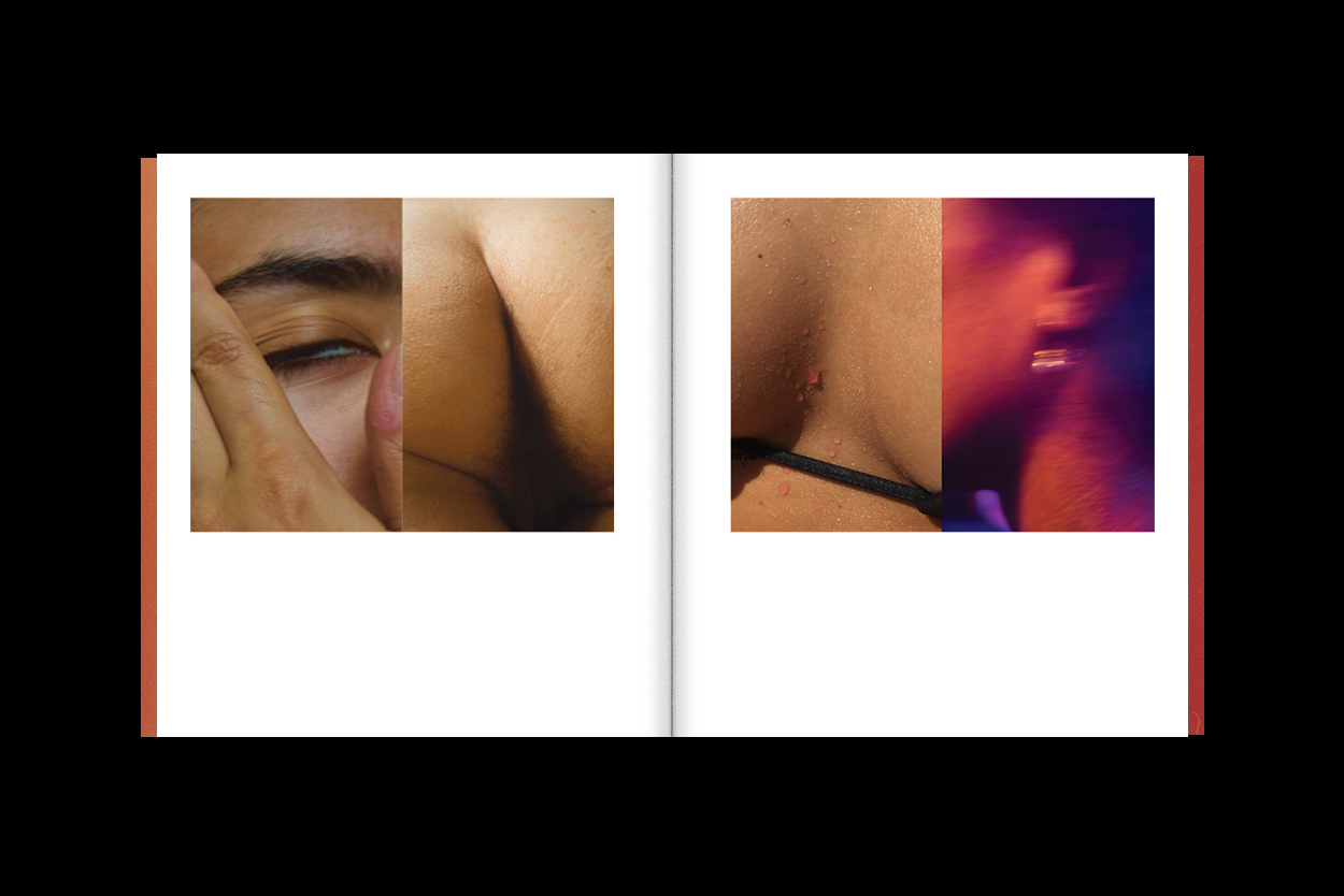
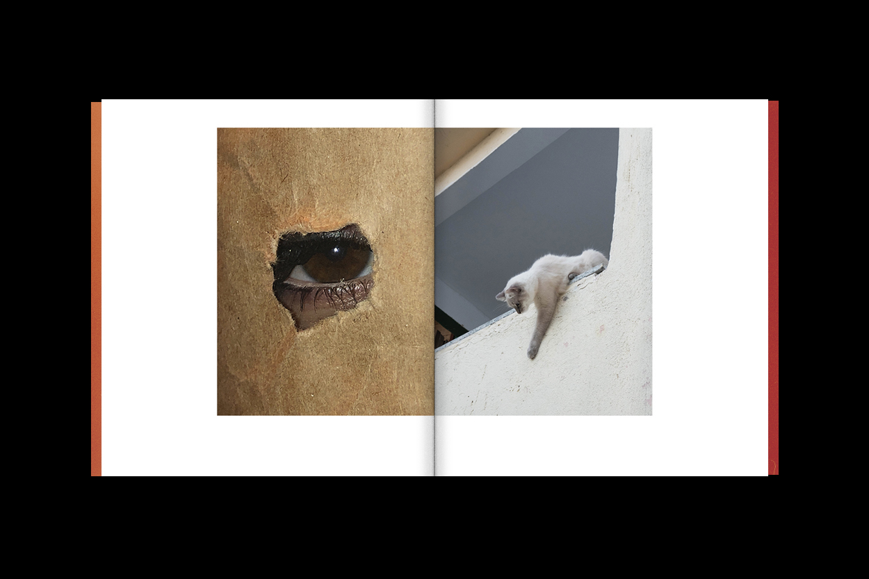
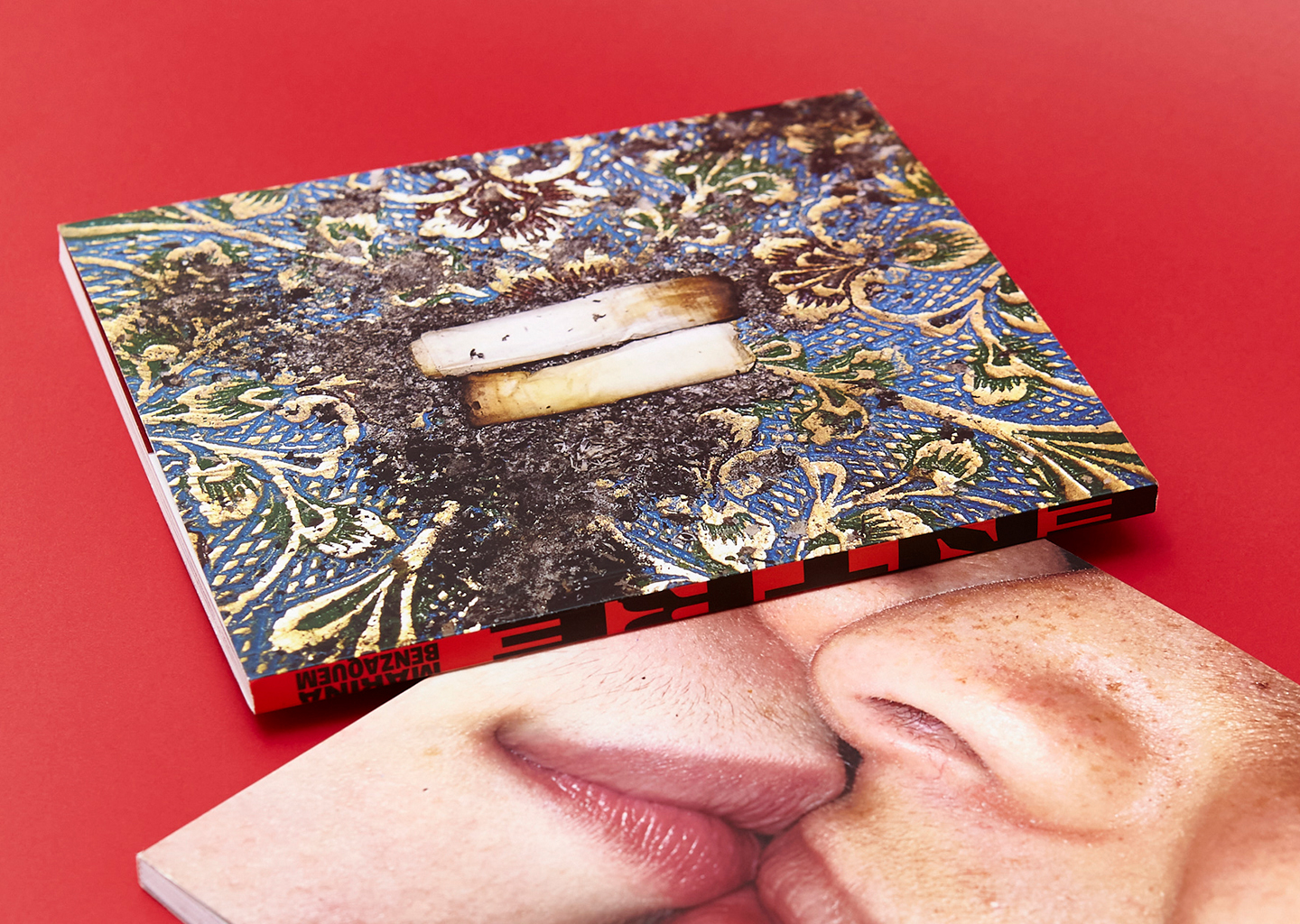
"ENTRE" is the first book by rising photographer from Rio de Janeiro, Marina Benzaquem (@zabenzi). The publication presents a series of photographic diptychs, unsetling juxtaposed pairs created by Marina with photos from her archive, taken between 2015-2020. By putting her pictures against each other, Marina creates collisions of textures, bodies, colors, shapes. A dialogue between the strength of her photos. The design of the book was an opportunity to articulate new relationships between the images; associations of associations. Starting from a larger set, 89 diptychs were selected and a narrative was created in the effort of reproducing the diversity of sensations which the images provoke, as well as the strangeness caused by the shock between each one of them.
︎ December 2020 design Daniel Rocha produced by Modinhas, Baladas & Sonetos texts Eduarda Freire and Poli Pieratti product photography Marcelo Salvador
packaging Barbara Tavares and Raquel Dimantas
The diptychs vary in size and combine photos from different types of cameras. The book's format was devised to accommodate the variety of proportions of the images and also the limitations imposed by the resolution of some of their files.
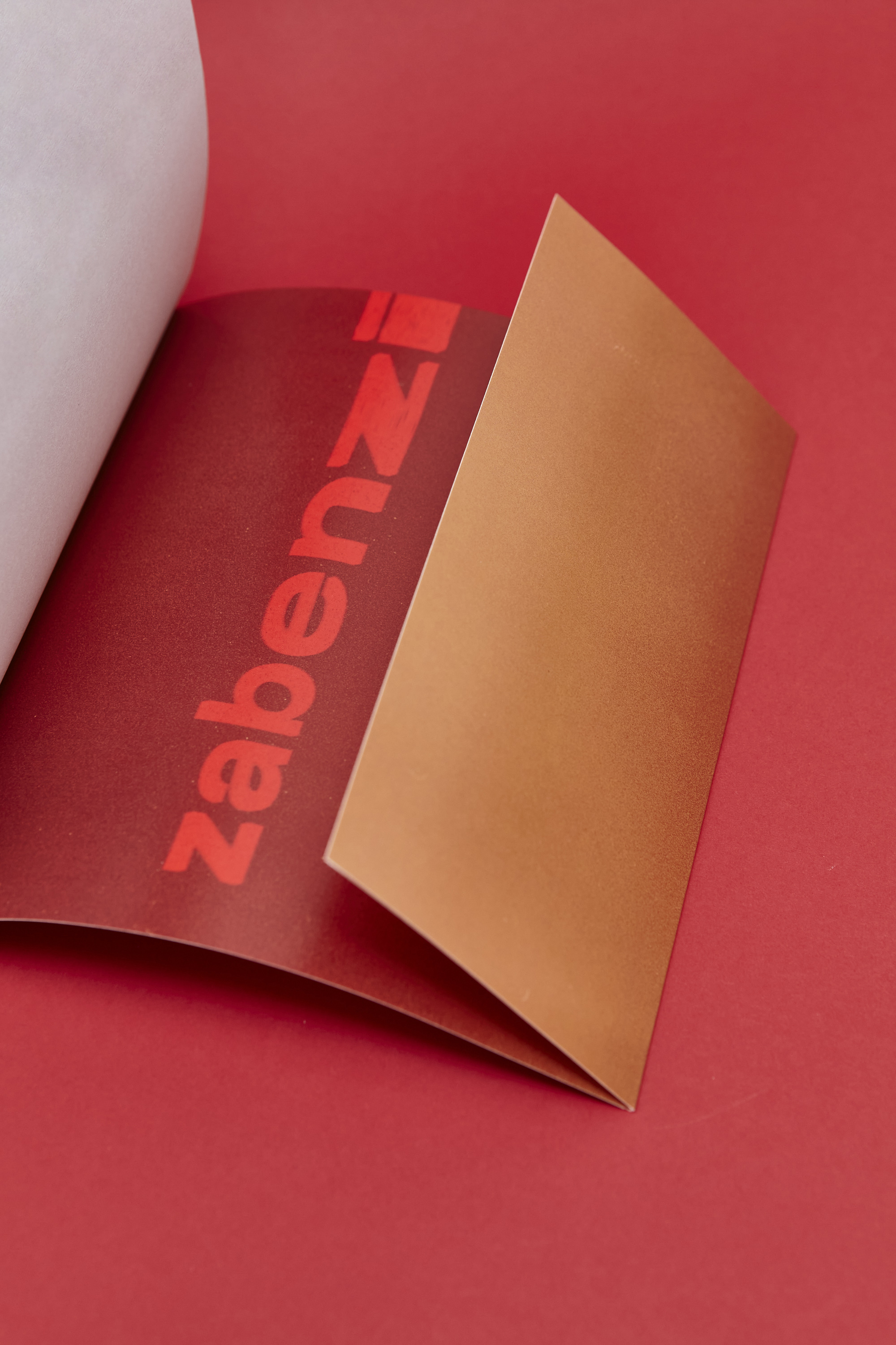
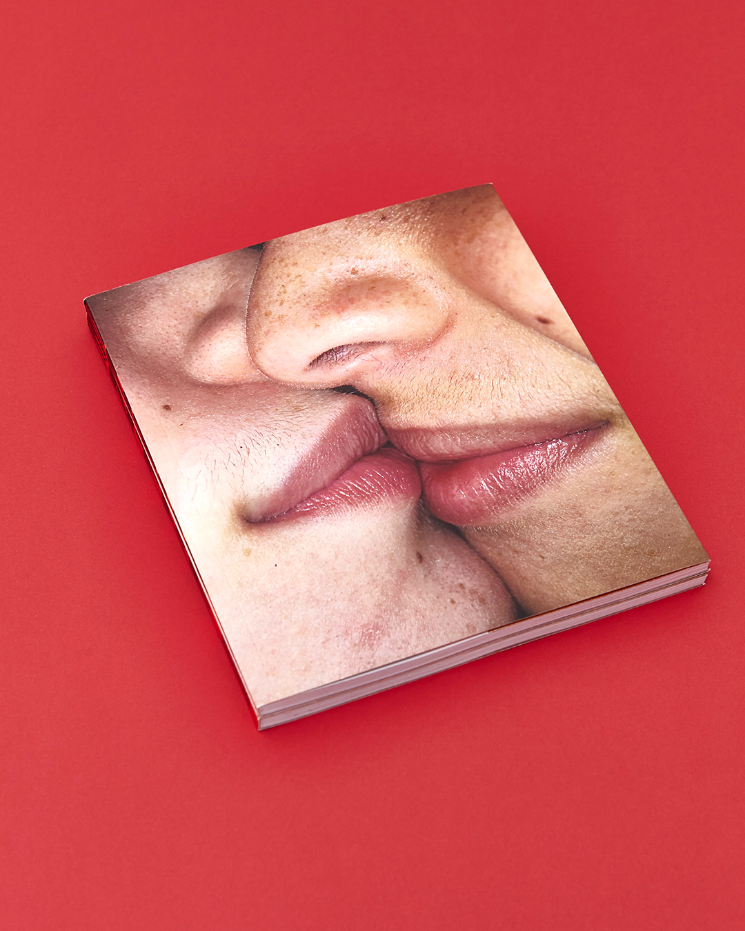
The title of the book has two meanings, which translate to "get in" and "between", a fortunate double-meaning word for a book of "doubles". "ENTRE" is a combination of letters that suggests symmetry and allows a division in two. This aspect was explored in the spine, which divides the diptych in the middle, as well as in the title page, with the word cut in half above a depicted spinal column. The image chosen for the cover summarizes the idea of the book — a pair of pairs, the epitome of collision.
The idea of collision also appears in the composition of the text in the book flaps. The typeface used in the texts (Vinila, by Flora de Carvalho) has distinctive inktraps, exaggerated empty spaces in the areas where the strokes collide.
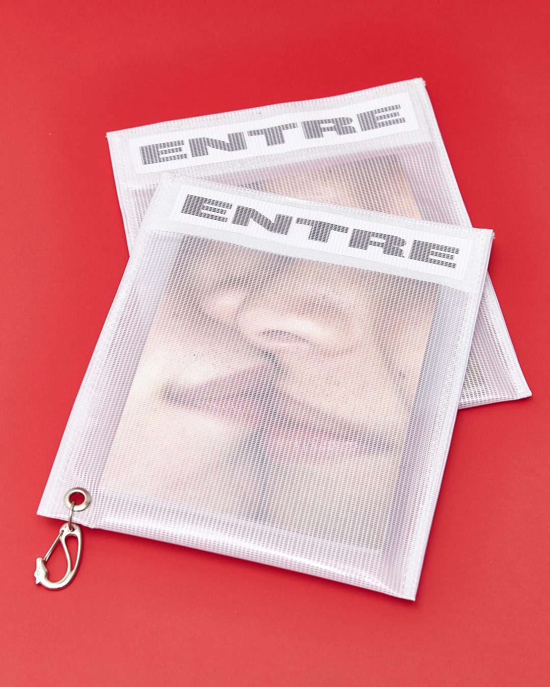
The book was released with a limited edition velcro-pouch packaging, designed exclusively for the launching campaign, by textile designers Barbara Tavares and Raquel Dimantas.